Crafting an Iconic Portfolio by Taxi Studio | Packaging Design Wins 2019 Muse Design Awards
Crafted Authenticity, Danish By Nature & Progressive Ingenuity
Company : Taxi Studio
Project Title : Crafting an Iconic Portfolio
Category : Packaging Design | Wine, Beer & Liquor
Country : United Kingdom
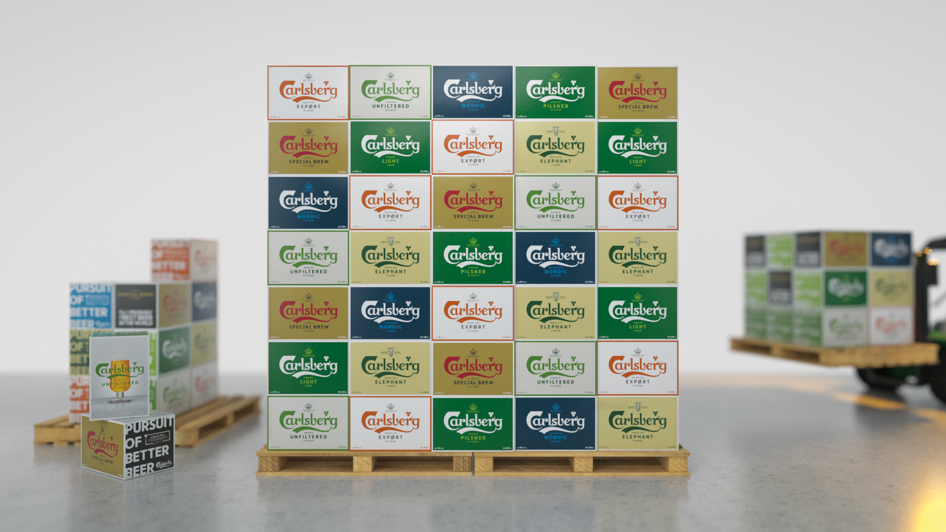
Carlsberg asked us to overhaul their brand in readiness for future growth. In the absence of a holistic visual system, consistency across variants and across markets was impossible. This was contributing to diverse consumer perceptions so that, for instance, Carlsberg had a poorer reputation in the UK than in India and Malaysia where it’s considered premium.
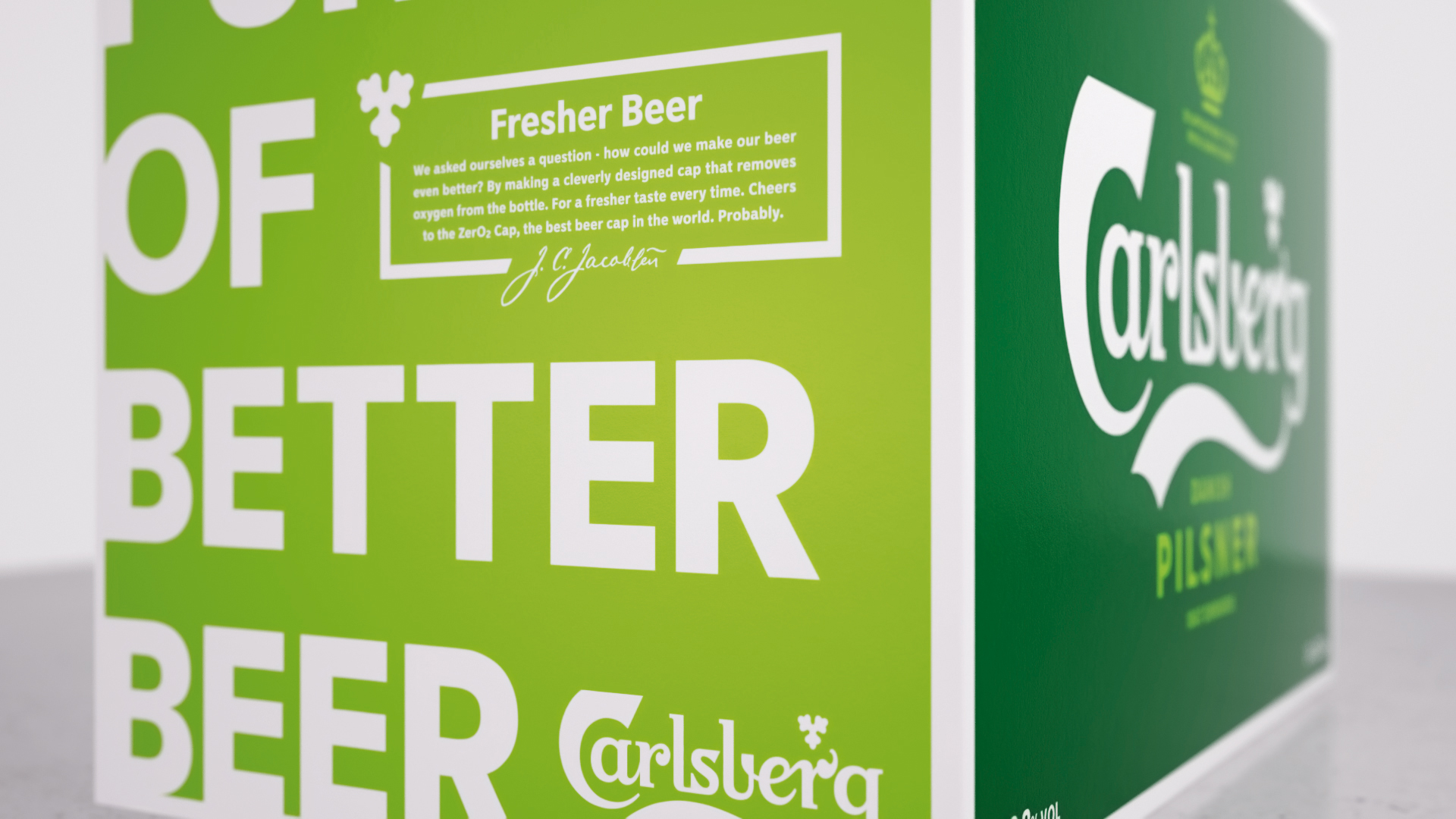
This was contributing to diverse consumer perceptions so that, for instance, Carlsberg had a poorer reputation in the UK than in India and Malaysia where it’s considered premium.
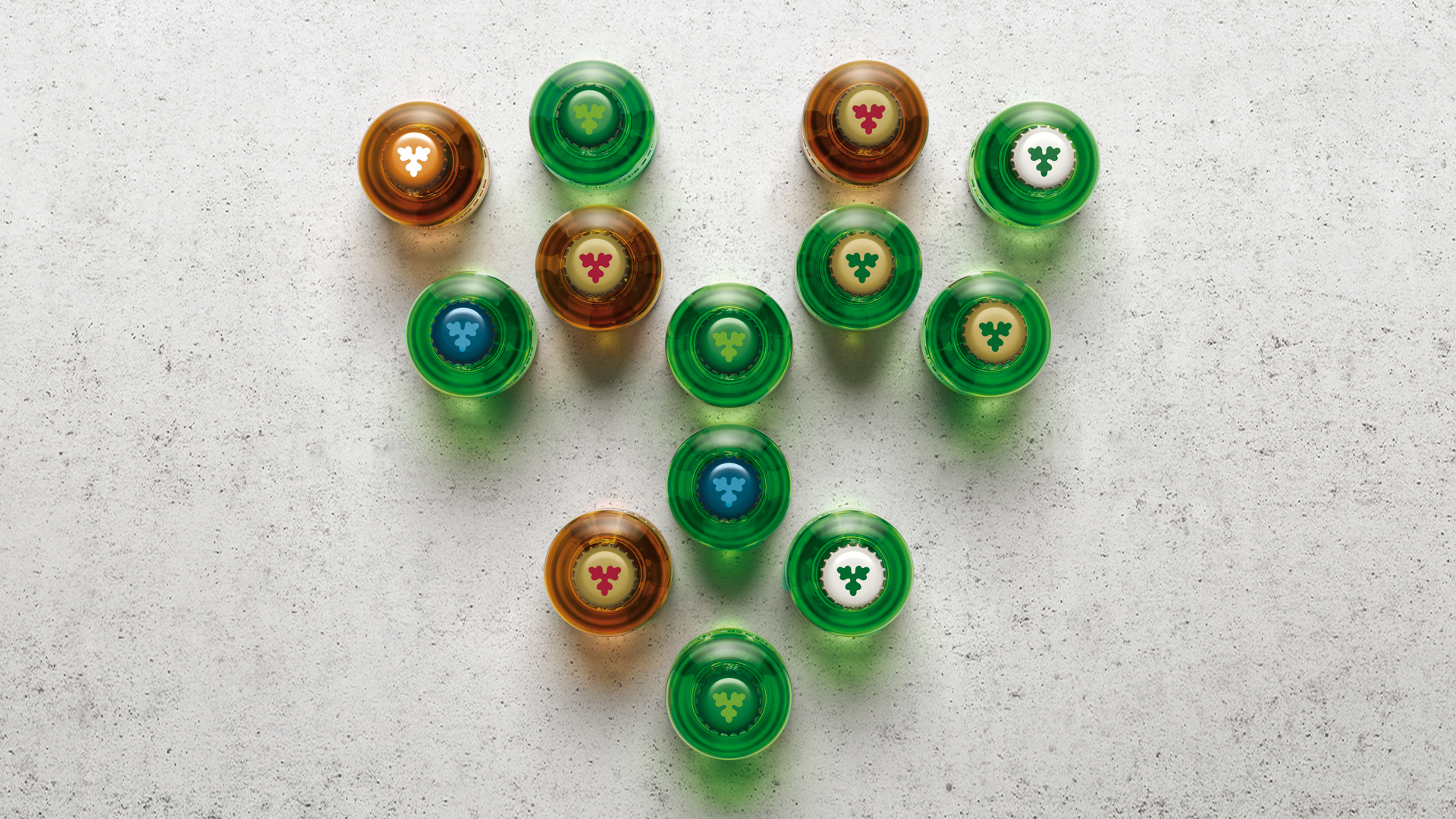
The forward-thinking outlook of Carlsberg’s founder J.C. Jacobsen is encapsulated in the ‘Golden Words’ inscribed in his will. At the heart of these is a statement of his devotion to ‘the constant pursuit of better beer’.
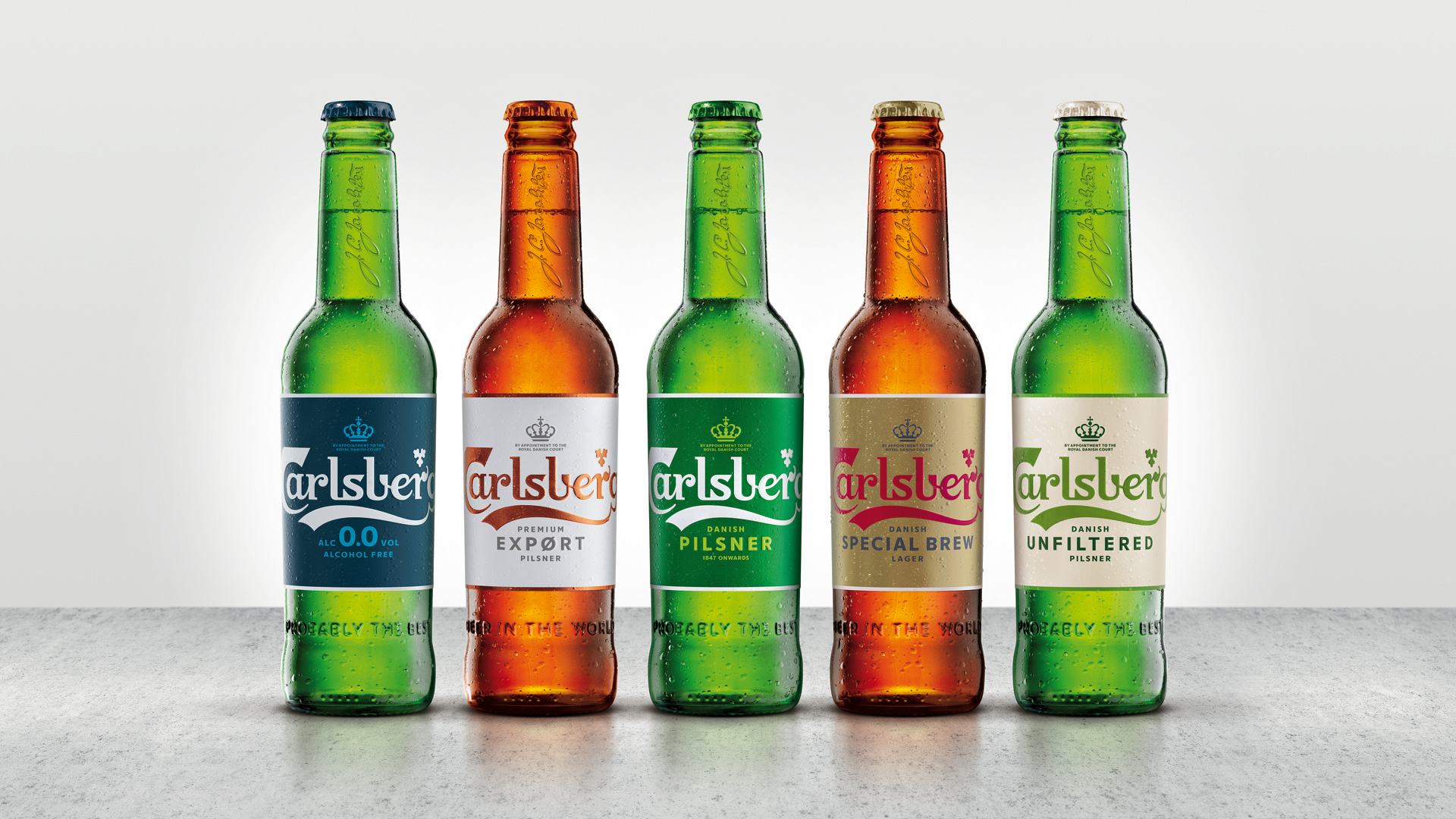
From this, we’ve extrapolated three design principles which have guided the packaging redesign: Crafted Authenticity, Danish By Nature and Progressive Ingenuity.
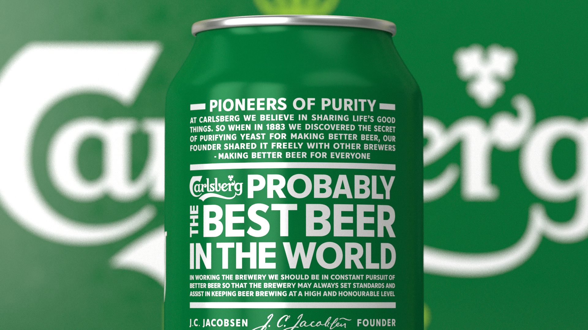
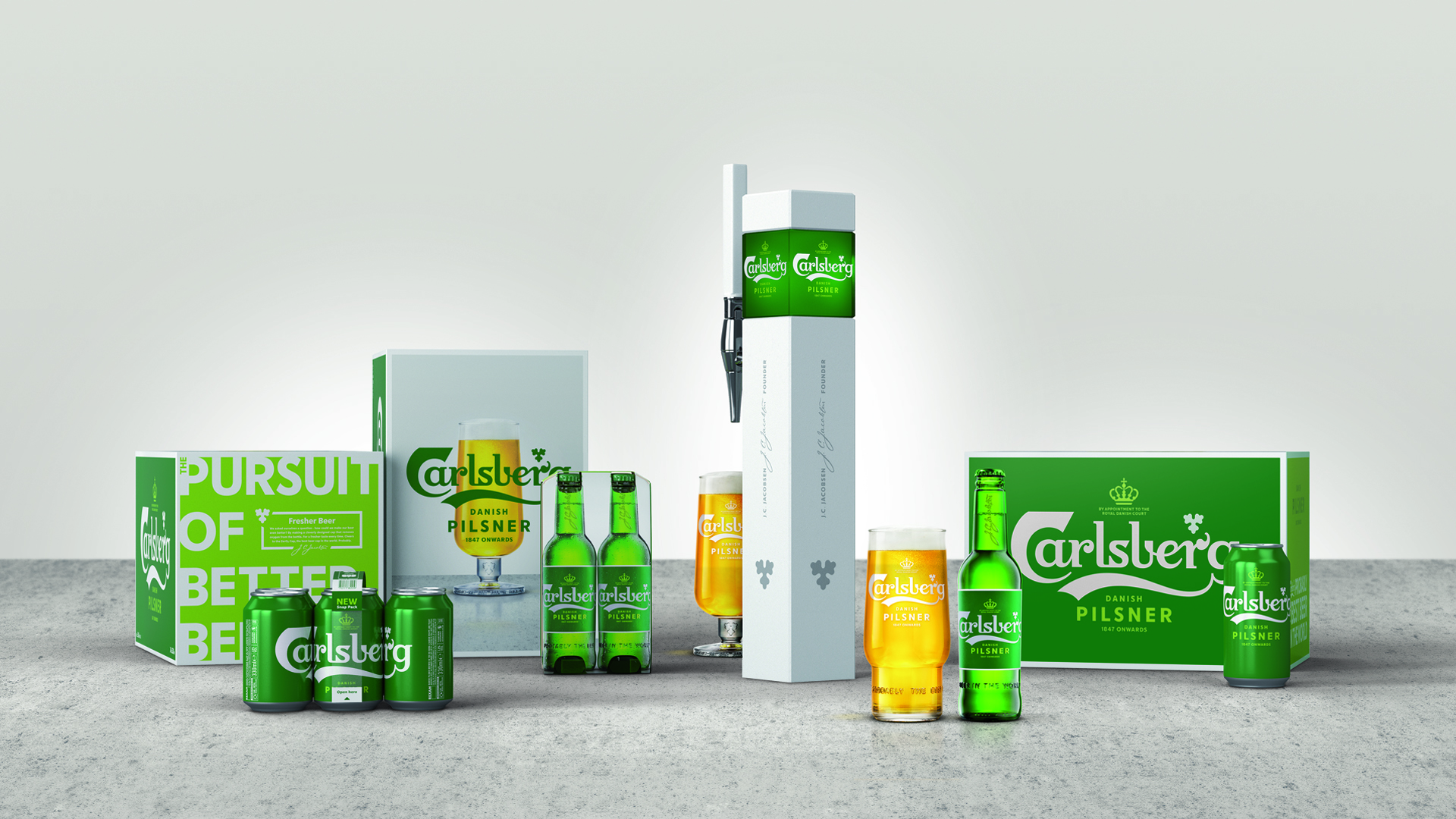
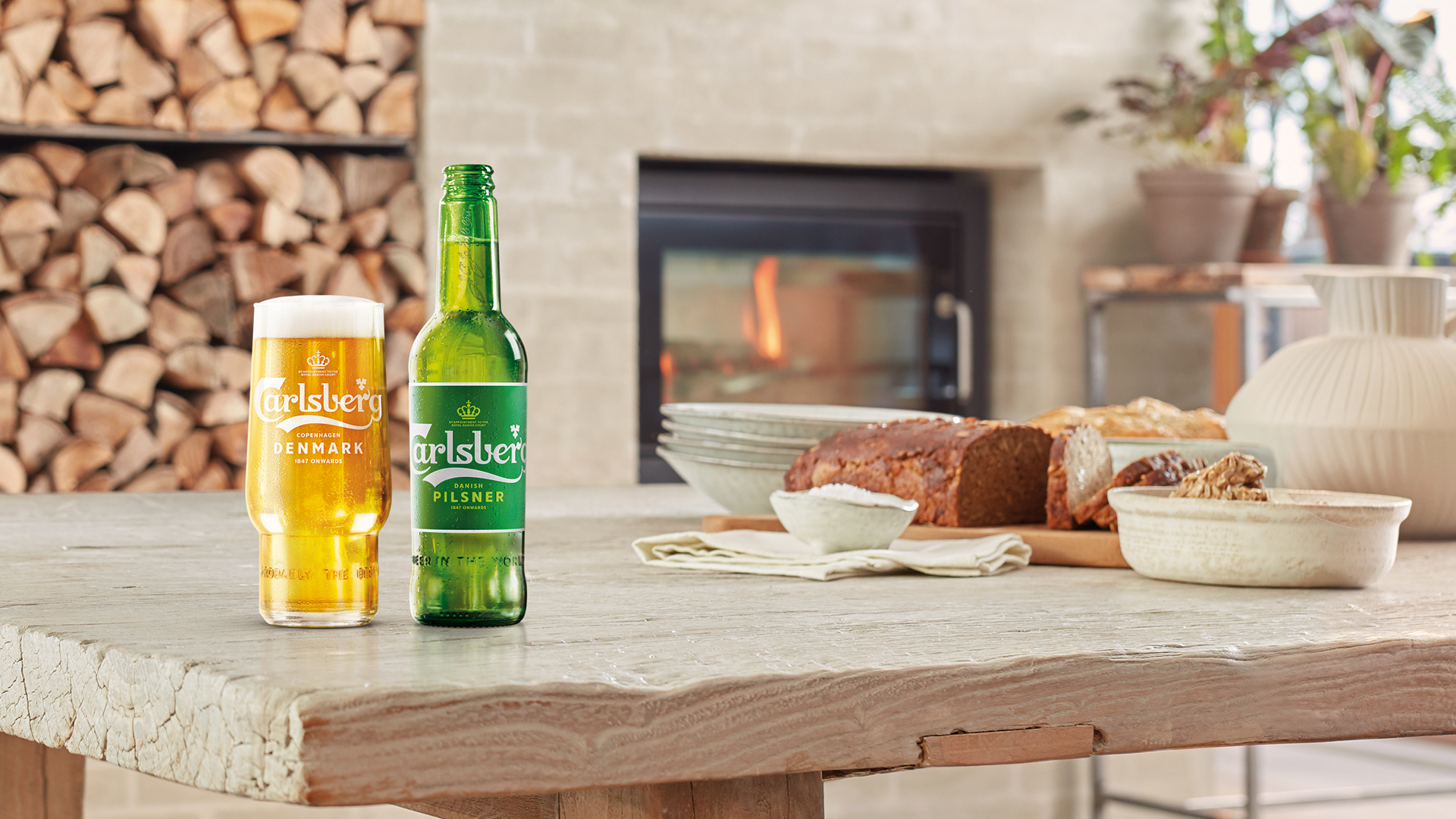
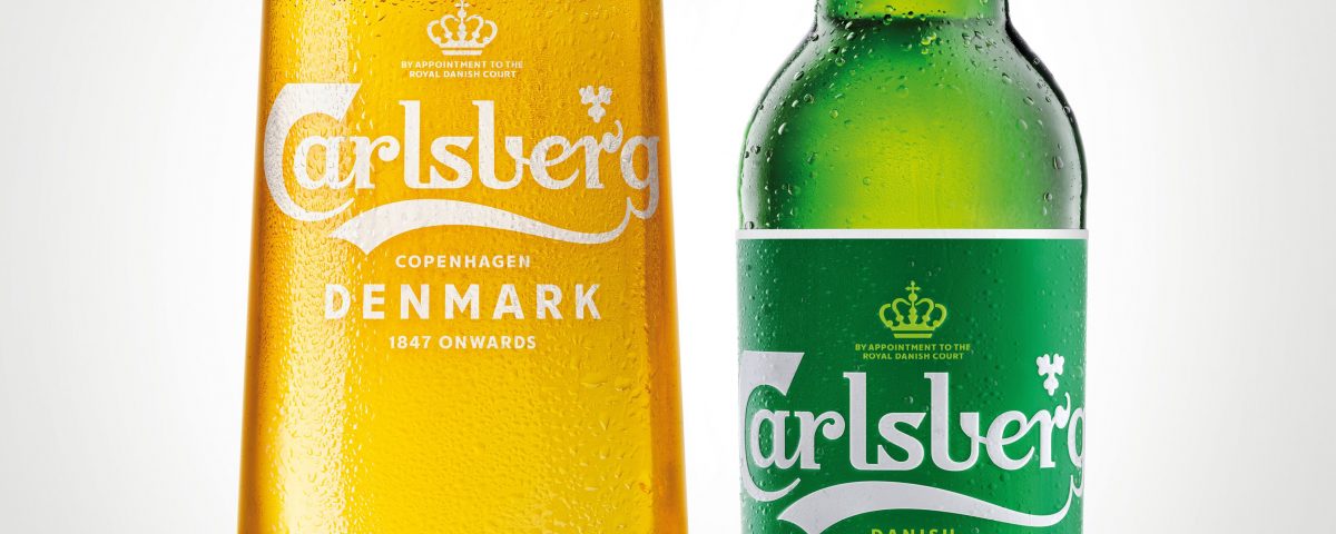
We seized the opportunity to express the brand’s progressive outlook though every aspect of its presentation, revisiting everything from the 100-year old logo to the colour of the bottle glass.
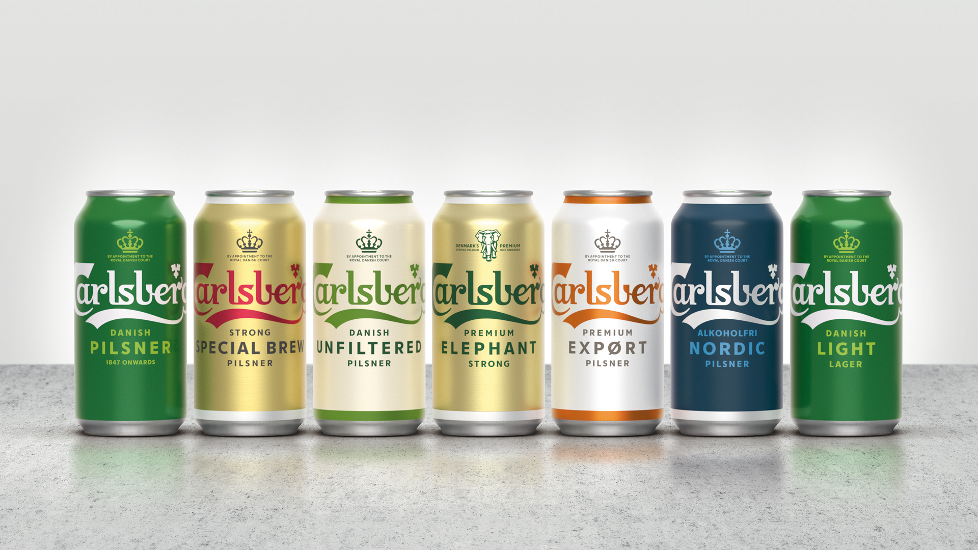
We reinvigorated the visual system, redrawing each element by hand and creating a new typeface.
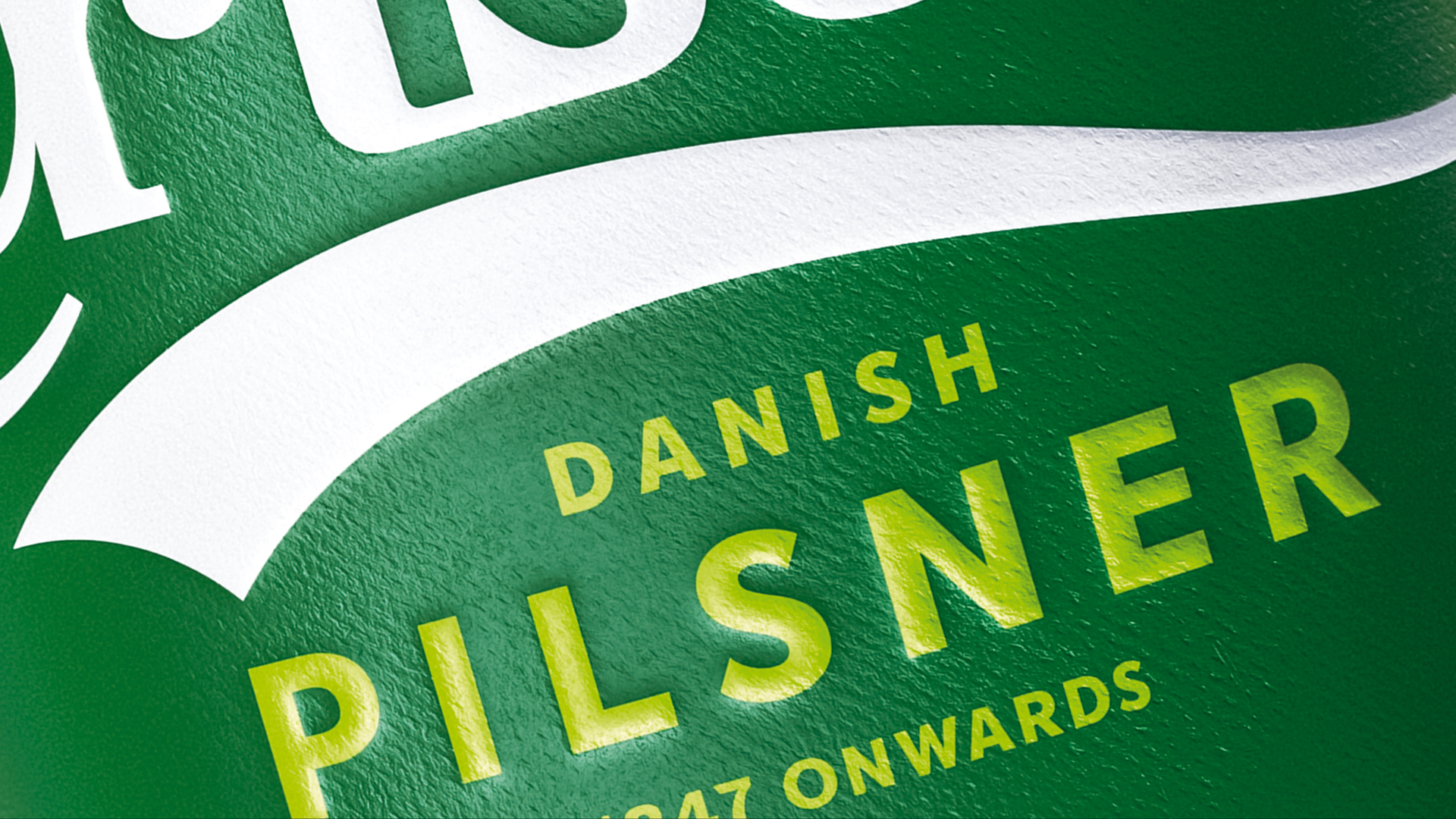
Inspired by the natural green of the buds and mature leaves of the hop plant, we developed a more eco-friendly ‘greener green’ as the brand’s signature colour.
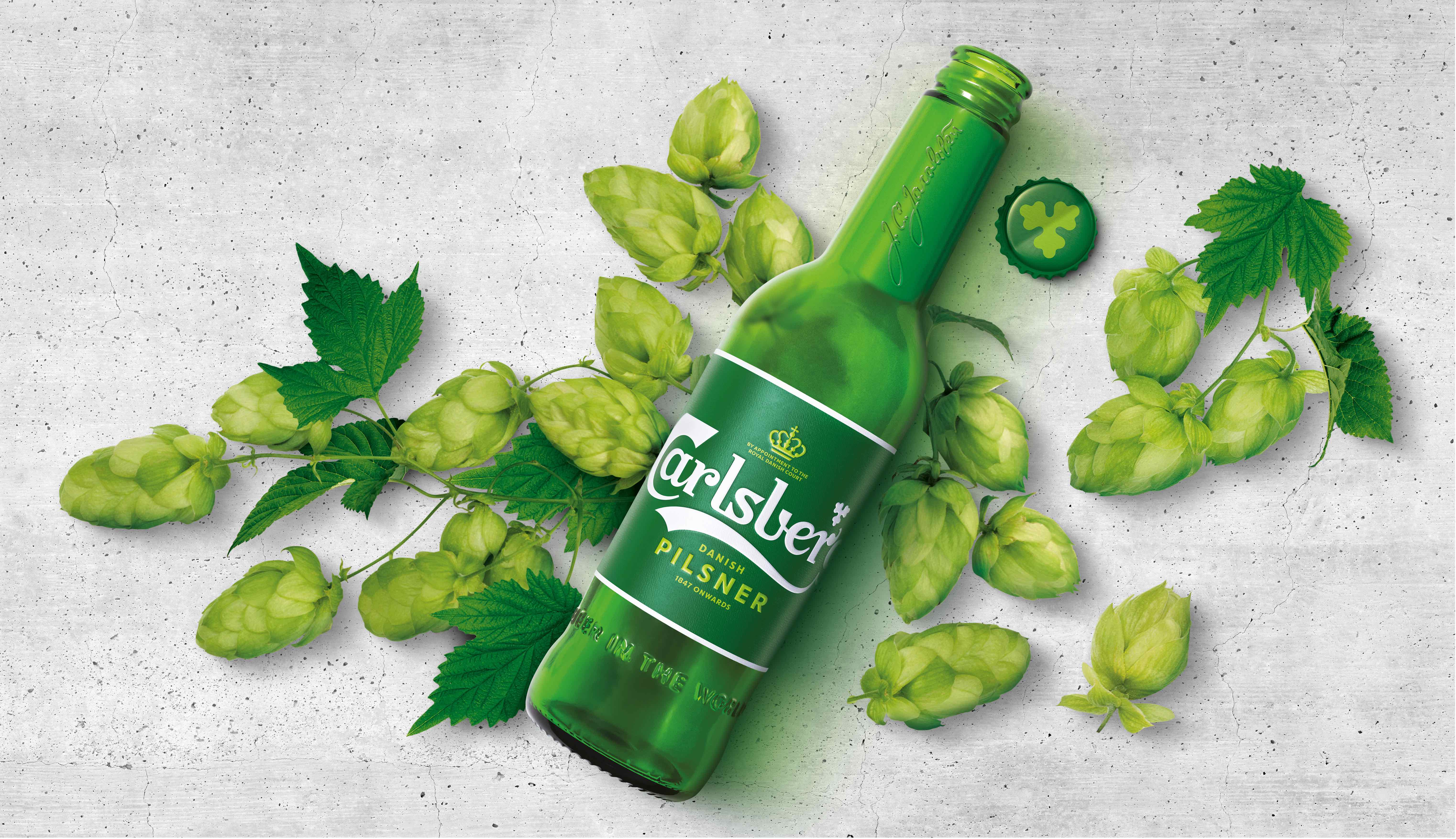
The rejuvenated Carlsberg packaging was launched in Scandinavia in 2018 and will be rolled out across 122 SKUs in over 80 markets worldwide in 2019.
