Interview With Natasha Mozz From United States

Gaze Upon the Unsurpassed Pinnacles of Architecture
July 7, 2022
True North Inc., Caring for You No Matter Where You Are
July 8, 2022
Natasha Mozz | MUSE Creative Awards
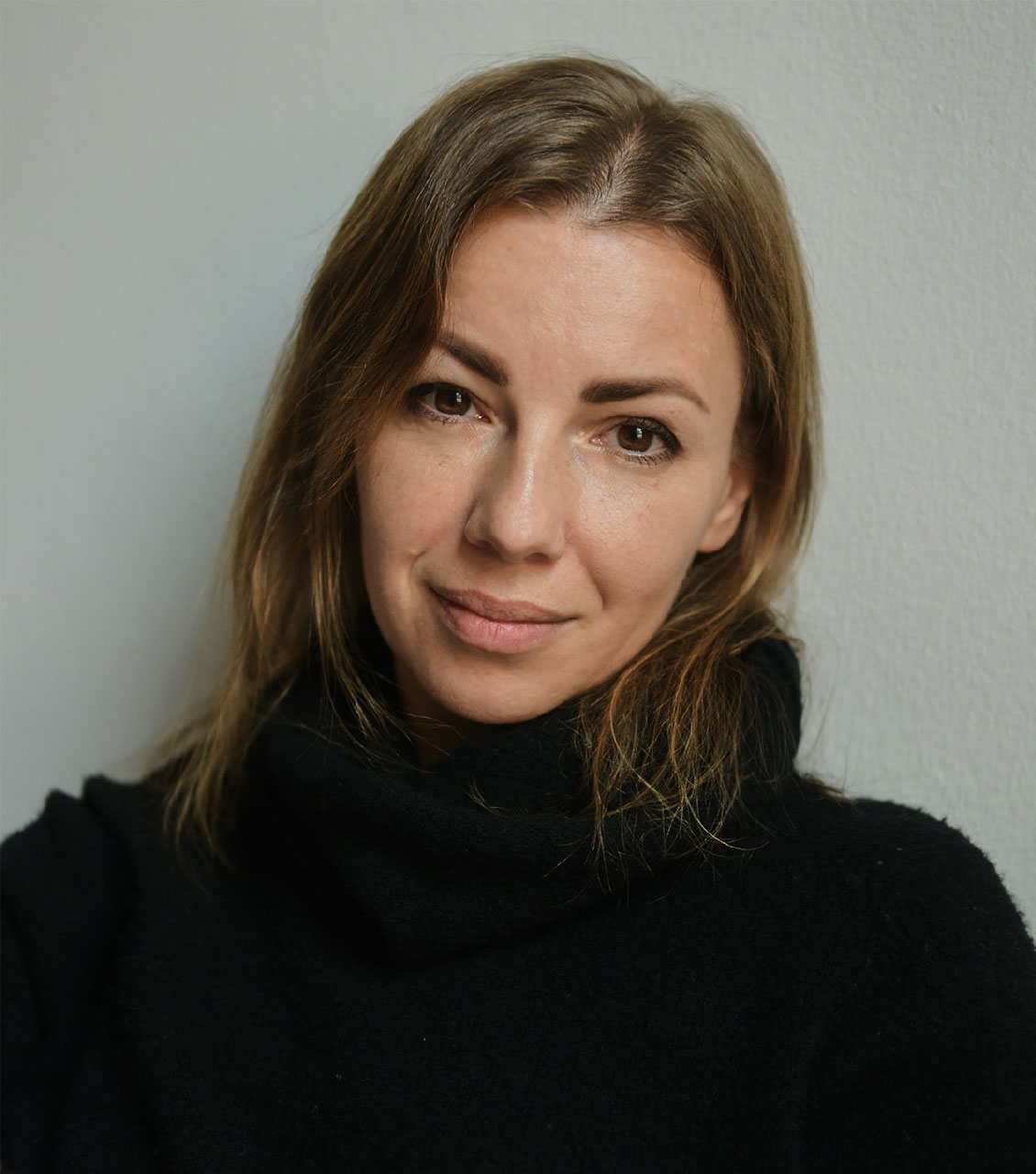
Natasha Mozz
Natasha Mozz is the driving force behind WearForever’s branding and logo that scored a MUSE Creative Awards Platinum!
Interview with the 2022 MUSE Creative Awards Winner - Natasha Mozz
Creative director based in New York. I've been working as a graphic designer, art- and creative director, exploring the possibilities of communication design in different industries and media channels. I was teaching concept development and typography at the British Higher School of Art & Design, and I have spent a year diving deep into type design and calligraphy. My obsession with typography lead to creating Typographist (https://typographist.org/) — an archive of typography sorted by country and decade. Also, a few years ago I founded a startup and participated in YCombinator Startup School.
I learned to read when I was less than three years old. I loved reading and I loved books. So I guess, for me, typography combined with imagery is the most natural way of understanding the world and communicating with the world.
Currently, I am collaborating with various agencies in the US, developing creative concepts and visual systems for brand identities and marketing campaigns. Besides that, I work on a few volunteer projects related to the war in Ukraine.
Expressing thoughts through visuals.
"Creative" to me basically means "thoughtful". Something that just looks pretty is not creative yet. Every great design project has some thoughts behind visuals.
If there's not enough information, I start with research — product/business, market, target audience, etc. After that, I develop a creative concept. This part is the most important, and it's 90% thinking, so I almost never do it in front of my computer. Throughout the years and thanks to the constant flow of concept-based work, I have developed a strategy, a thinking process that helps me to be efficient and get strong concepts every time regardless of the type of the project. Then I refine a visual system, shaping it into a set of elements and their behavior and relationships. Along the way I constantly test the idea making dozens or hundreds of super quick hypothetical designs of whatever brand channels could potentially happen for that brand.
The thinking process is my favorite part. The moment when everything comes together and it becomes clear what kind of visual code translates the business in the best possible way is incredibly exciting.
I guess it's logic. No matter what I do there's always some kind of conceptual thinking behind it, even in the smallest projects. It's just easier to work this way. I don't have any specific visual style — it depends on the project.
Oh yes. These days it's hard to speak about Russia with good feelings, but regardless of all the horrible things that are happening, there are still El Lisitsky, Rodchenko, Rachmaninov, and Tolstoy, as well as fantastic modern designers I have learned from. The complexity of Russian culture and its strong philosophical component definitely formed my way of working through a deeper understanding of things and searching for deeper meanings in order to develop well-communicating designs.
It is definitely an honor, I am very happy to receive the award. Thank you!
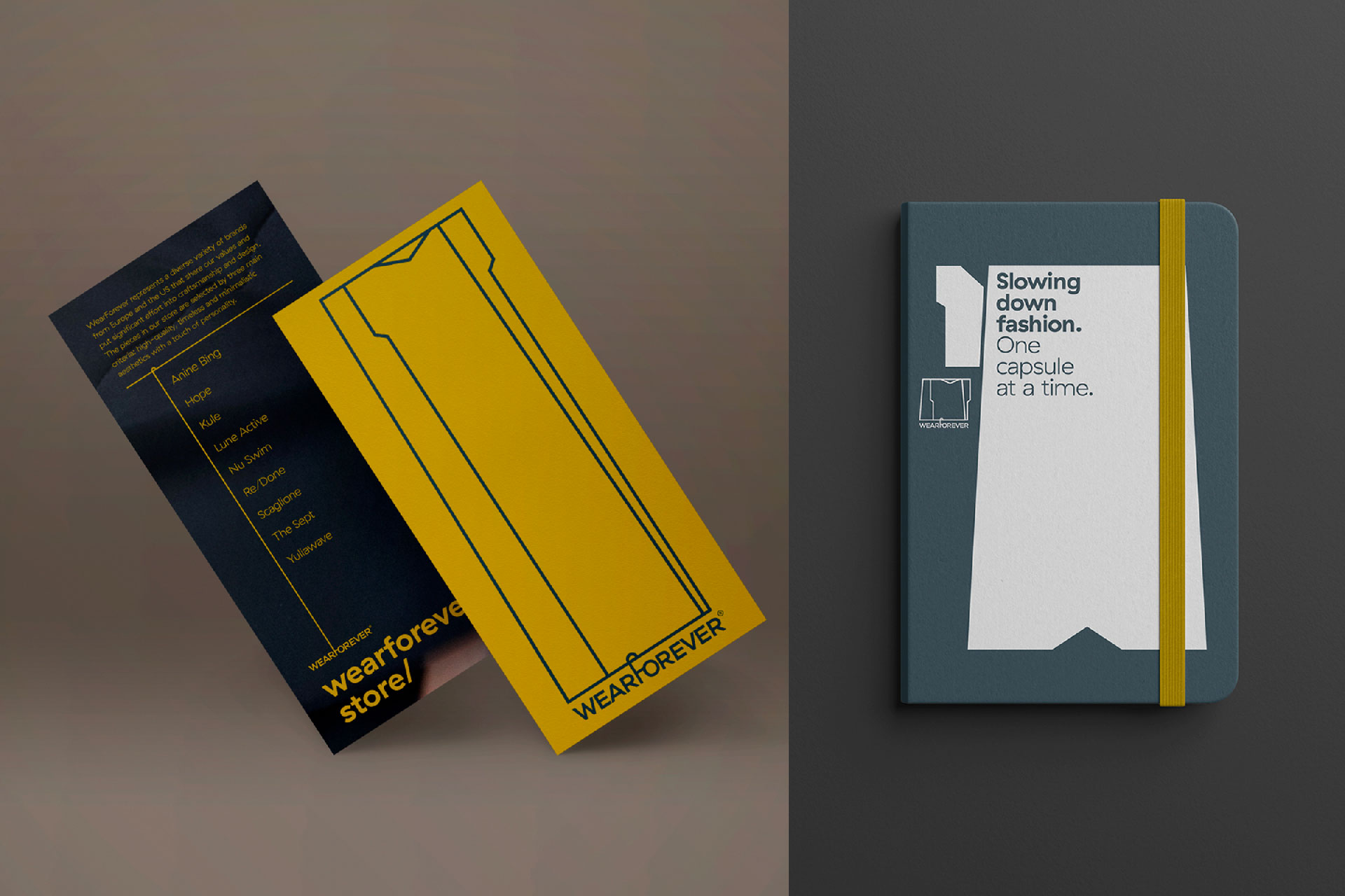
WearForever is one of my favorite projects. It's a Swiss multi-brand online store offering capsule wardrobes — a combination of pieces from different brands selected by a stylist. I have created a visual identity that helps the business effectively communicate its value proposition: "a smart combination of garments is what makes a great wardrobe". The idea is to use shapes of clothing which combined together make new forms, half-abstract shapes. Just like the business itself, it's all about combination. Playing the rules of the system, shapes work differently on different brand channels, constantly moving, transforming — changing intonation but keeping the same voice. As a result, we have a dynamic, flexible, and scalable visual system with endless combinations of shapes that work as visual elements, a grid, a base for display typography, and so on.
An online clothing store is the type of business that can't follow the MVP model and start with high-level branding, it has to look like an established brand from the very beginning, with instagrammable visuals and an ambitious brand feel. It was an interesting challenge.
Since I am working as an independent creative, awards play a big role in developing my business by helping to win new clients.
- Meaningfulness.
- Collaboration with talented and smart people.
- Helping businesses to grow and be successful.
Creative coding. I'm quite sure that brands will be able to speak a language tailored to each customer, and when creating brand identities we will not talk so much about elements, we'll define identities more through behavioral things and specifics of interactions.
Related to the previous question — check out creative coding, at least to understand its possibilities. Besides that, learning how to develop creative concepts is the best gift you can give to yourself. The rest will grow out of it.
Case studies of the great design projects. Any resource that gives an understanding of the thinking process behind the project.
Also, not the most obvious, but the history of typography is the best way to understand how typography works.
I don't think that logo is that important.
I am surrounded by very talented and successful friends who also know how to have fun and enjoy life. I think that the right combination of those things is the key to happiness.
Understanding the value of my own point of view, always learning, working hard, being kind, analyzing a lot, and enjoying life.
Thanks for having me!
Winning Entries
WearForever Brand Identity | 2022
(read more at MUSE Creative Awards)
WearForever Logo | 2022
(read more at MUSE Creative Awards)
Natasha Mozz
Natasha Mozz is the driving force behind WearForever’s branding and logo that scored a MUSE Creative Awards Platinum!
Complete your wardrobe with this one-of-a-kind timepiece by Louis Monet in our article on FIRE DRAGON here!


