Where the Gulf Meets the Interior: NKEY Full Interior Design's Awar...
JUNE 24, 2026

Staying at home during this pandemic must be frustrating for all of us, and what's there to do besides, well, having a good glass of wine to spend the day away?
Well, look no further than 30th Century Opera Wine! Before you even taste the wine, come savor the design first:
Designed to maximize the tasting experience by all the wine connoisseurs, the packaging takes us the transcendence of operas to its imaginary limits.
The wine begins with a fruity note that becomes more floral before finishing with oak-aged notes and textured with tannin.
Great design for a bottle of wine, right? Now, take a sip, rewind, and come bask into the perfect glass of red with one of the best packaging designs for a wine in the market!
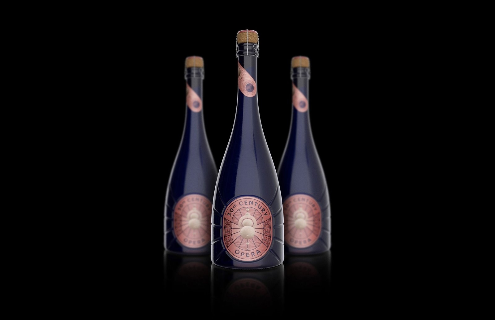
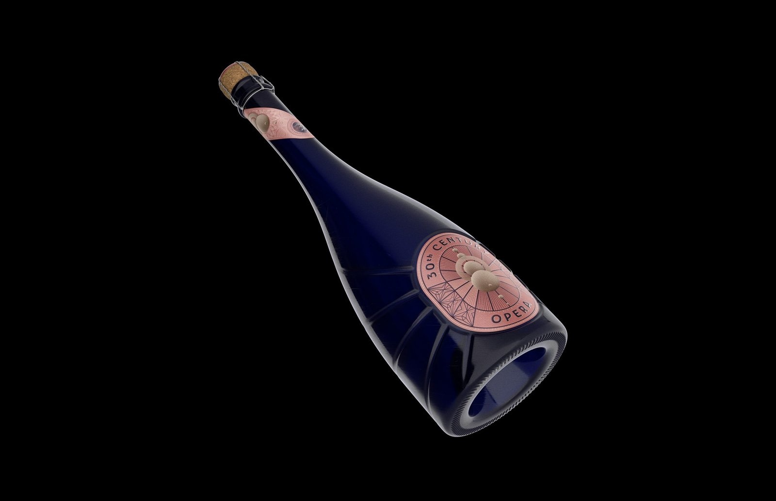
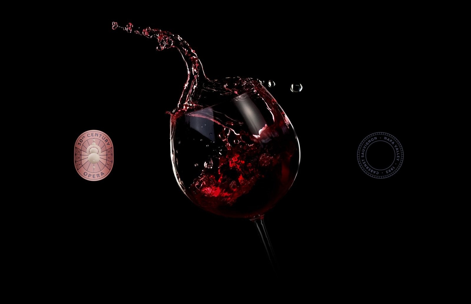
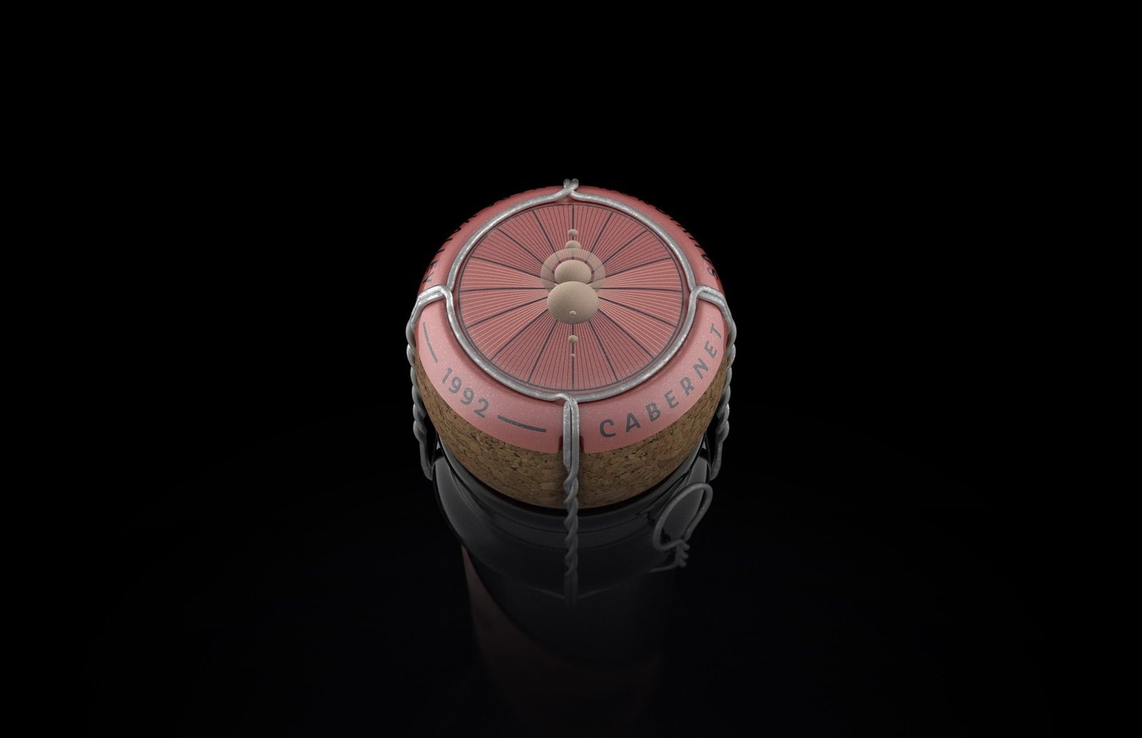
Entry Title: 30th Century Opera Wine
Entrant Company: C.Carbon Studio
Client: 30th Century Winery Co.
Interested in packaging designs like this? Check out our article about 4 best packaging designs today!