Blandy’s Wine Packaging by Omdesign Wins 2017 Muse Creative Awards
Vega Digital Awards | “Deakin University – Ingenious” Promotional Video
December 4, 2017Fight 4 Pride MMA Website Design Wins 2016 Vega Digital Awards
December 11, 2017A Whole-New Premium Packaging
Blandy’s wine packaging design rebranding by Omdesign is a Platinum Winner recipient in the 2017 Muse Creative Awards. With a history of over two centuries, Blandy is a world leader in the production of the more superior categories of Madeira wine.

Company : Omdesign
Client : Blandy’s
Project Title : Rebranding Blandy’s
Category : MARKETING BRANDING & DESIGN | Packaging Series / Campaign
Country : Portugal

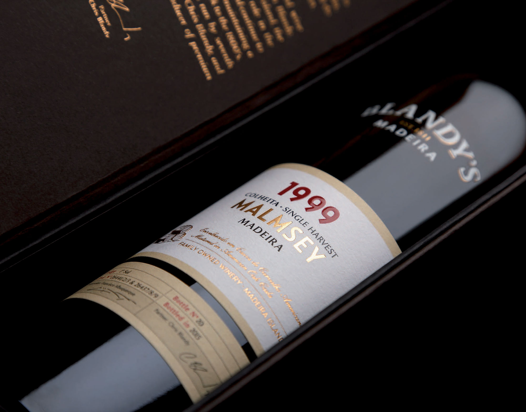
Recently, Omdesign restyles and renews the identity of the whole Blandy’s range. The new look of Blandy aims to reinforce its positioning and the premium nature of the brand and its wines. Thus, the new design is more up-to-date with a differentiating identity. No to mention, the design is an inspiration of the strong tradition of the company. One that has been run by seven generations.
Blandy adapts a new image into their entire range. Additional features include the family crest, which reinforces the establishment date of the company. This includes the symbol of casks which is a reference to the aging of Blandy’s wines in oak casks. Oak aging, an ancient technique still used today in the production of these unique nectars are known worldwide.

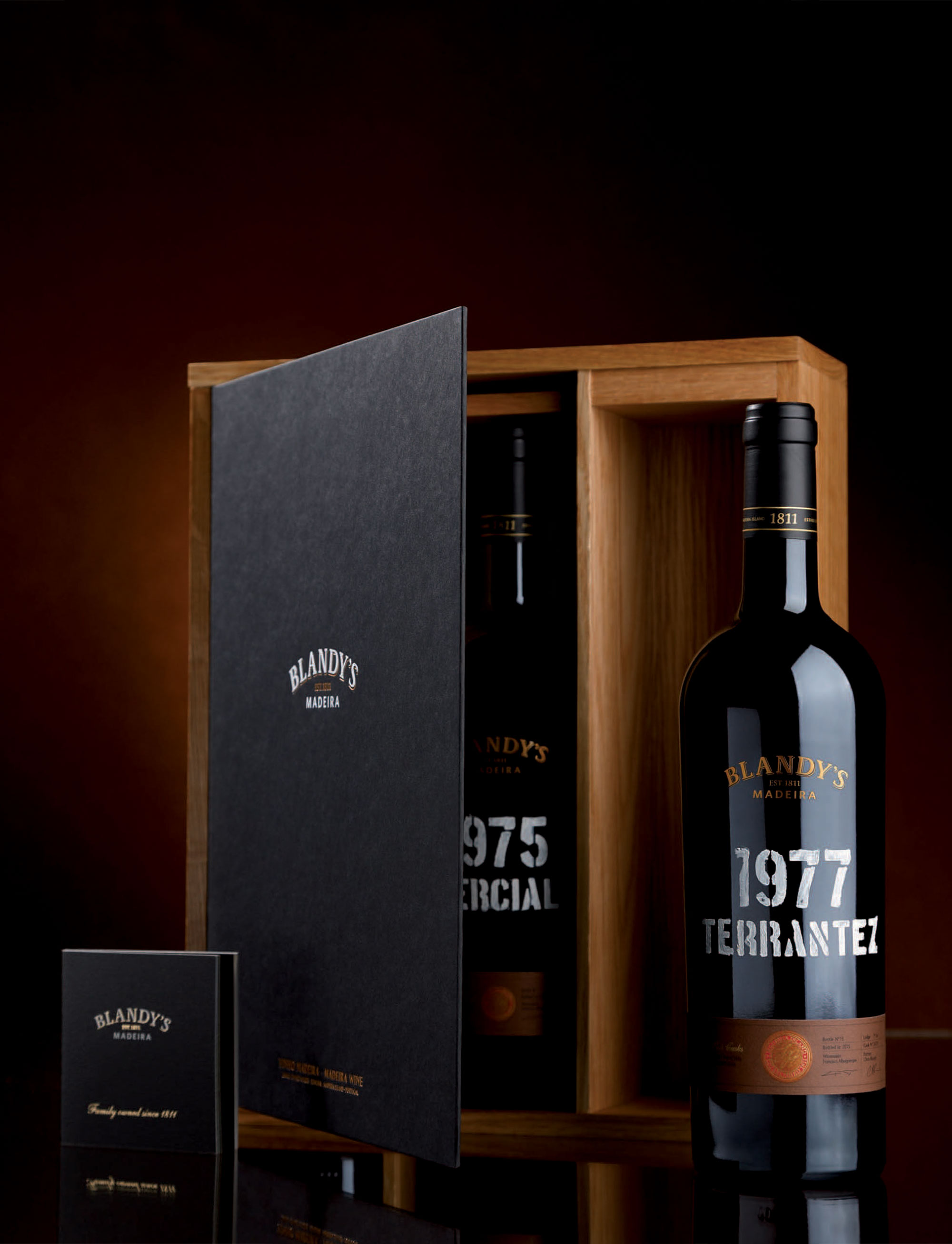
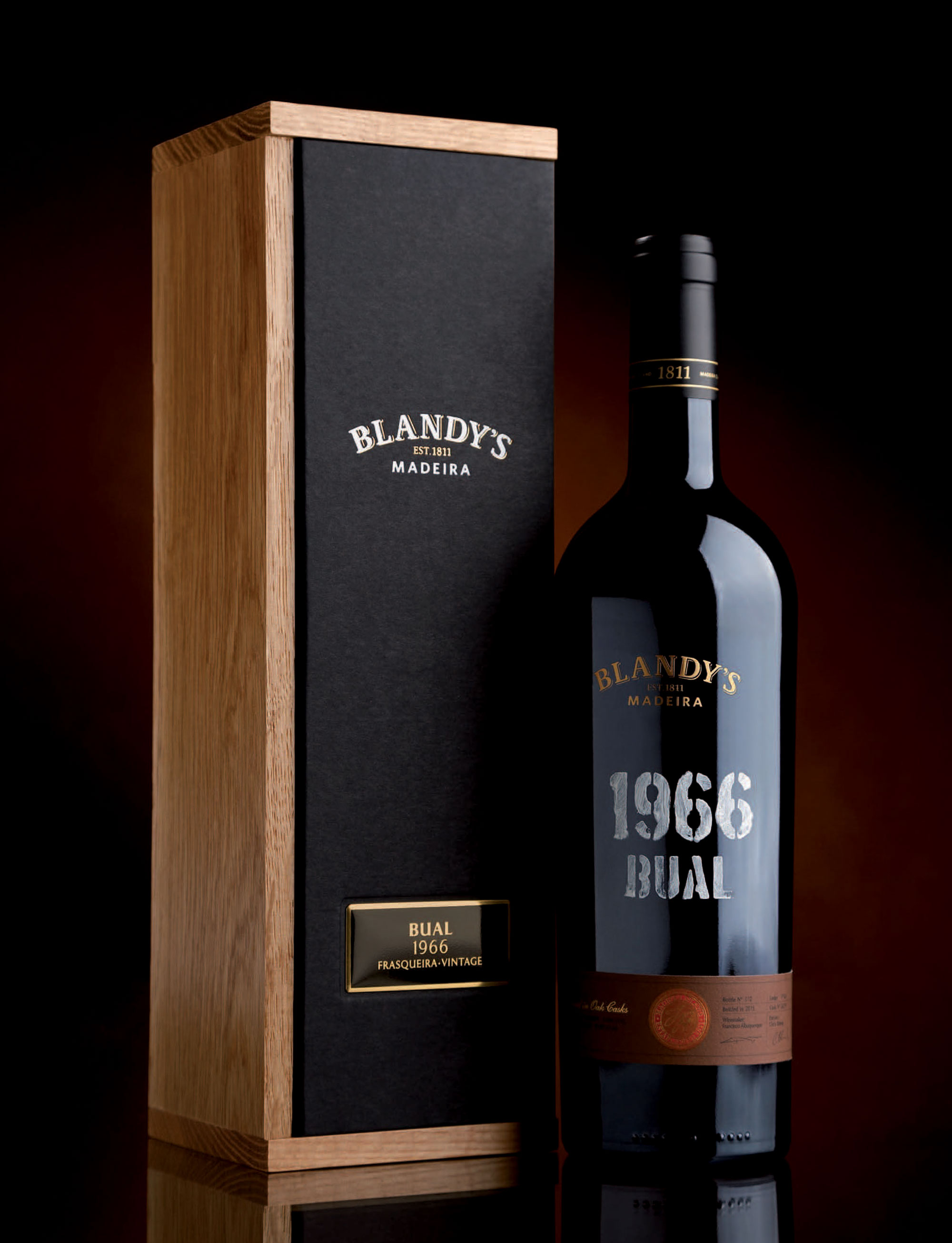
The Portuguese advertising agency also developed new premium packaging for the more superior categories, in oak and cardboard. All of the colours and materials associates with Madeira wine. The Frasqueira packaging has a new logo. Besides, heat engraving forms the Blandy family crest on top of the wooden box. Inside, there is a certificate of quality and origin of these wines, as well as a brochure.
Visit Muse Creative Awards Winner Page for more great works.
Advertising Awards | Muse Awards | Creative Awards | Photography Awards | Website Awards | Video Awards


