Interview with Yulia Gonina, the Founder of Schrifteria Foundry

Interview with David Mateo Gonzalez: The Vision of a Digital Composer
December 12, 2024
Interview with Mariko Saji: Creativity Across Branding
December 12, 2024Yulia Gonina
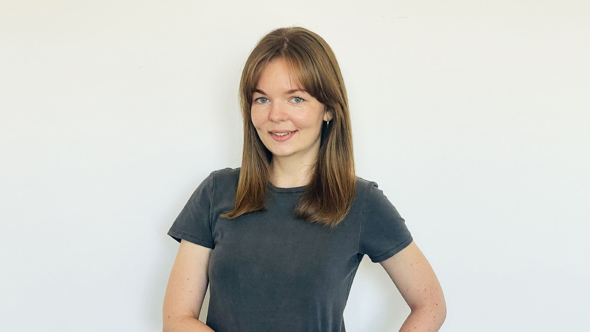
Yulia Gonina is a type designer and founder of Schrifteria Foundry. Her passion for typography inspires her to create unique typefaces that blend artistic vision with practical design solutions. She draws inspiration from her surroundings, from the romantic cityscapes of Stockholm to the dynamic energy of Belgrade.
I’m Yulia Gonina, a type designer and founder of Schrifteria Foundry. My passion for typography has led me to create unique typefaces that blend artistic vision with practical design solutions. Over the years, I’ve drawn inspiration from the environments I’ve lived in, from the romantic cityscapes of Stockholm to the dynamic energy of Belgrade.
Before founding my own studio, I worked as an art director at TypeType. Today, I’m proud to have my work recognized, including winning gold at the MUSE Creative Awards for SFT Schrifted Serif.
Schrifteria Foundry is a boutique type design studio where we create distinctive typefaces for brands, designers, and creatives worldwide. I lead the design process, collaborating with freelance designers on some projects, while also managing the business side of the studio.
My role involves everything from researching and sketching initial concepts to overseeing font development and working closely with clients to create customized font solutions that meet their needs. Schrifteria is about crafting type that not only looks beautiful but also serves a purpose.
To me, creativity is about finding new ways to express ideas and solve problems. It’s not just about making something visually appealing, but about creating something meaningful and functional.
In type design, creativity means balancing aesthetics with readability and ensuring that each font brings something unique to the table. It’s about pushing boundaries while still respecting the craft and purpose behind each design.
My process for developing a typeface starts with deep research and observation, often drawing inspiration from the environment, culture, or the specific tone I want the font to convey. I begin by sketching various forms and exploring how different shapes can express the desired mood or function.
Once the concept is more refined, I focus on consistency across the characters, ensuring harmony in proportions, spacing, and technical precision. Testing the font in different contexts is key to making sure it works well in real-world applications, balancing both aesthetics and usability throughout the design process.
My creative style is characterized by a balance between clean, modern aesthetics and subtle, expressive details. I aim for clarity and functionality in my designs, but I also like to infuse personality into the forms, often drawing inspiration from the environment and culture around me.
My typefaces often feature smooth curves, thoughtful proportions, and carefully considered contrasts, allowing them to feel both contemporary and timeless.
Having lived in many different places and countries, my surroundings have had a profound influence on my creative process. Each city I’ve called home has left its mark on my work. For example, the time I spent in Stockholm inspired SFT Schrifted Sans and Serif, where I captured the blend of the city’s structured, rational design with its softer, romantic atmosphere. Belgrade, with its dynamic and free-spirited energy, influenced the creation of SFT Ritam Sans.
These experiences shape not only the visual aesthetics of my typefaces but also the emotions and stories they convey, making my work deeply connected to the cultural heritage of each place.
Winning the 2024 MUSE Creative Awards is an incredible honor for me and Schrifteria Foundry. It validates the hard work, dedication, and creative vision that goes into each typeface we create.
For me personally, it’s a proud moment to see SFT Schrifted Serif recognized on such a prestigious platform. It also gives Schrifteria Foundry greater visibility, showing that our work resonates not only with clients but also within the global design community.
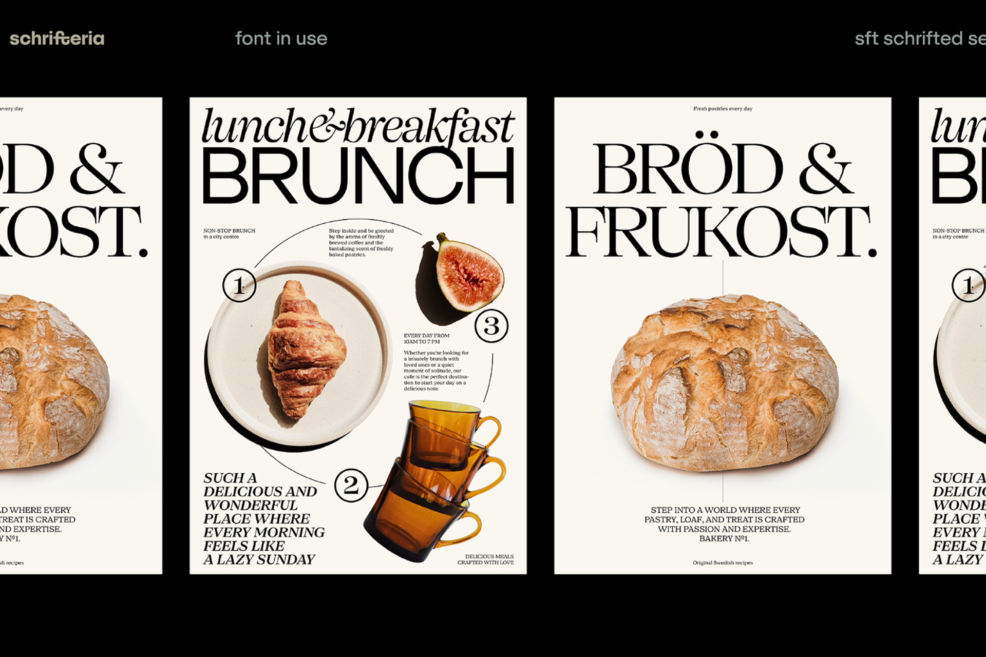
I entered SFT Schrifted Serif into the 2024 MUSE Creative Awards because it represents a significant part of my design journey. It’s a modern serif with a unique character, combining elegance with functionality.
I chose this project because I felt it captured the essence of what Schrifteria Foundry stands for: creating typefaces that are both visually distinctive and versatile enough for a wide range of applications. Seeing it receive this recognition feels like a validation of that vision.
The biggest challenge with SFT Schrifted Serif was creating a serif typeface that captured the same essence of Stockholm as its grotesque counterpart, SFT Schrifted Sans. The grotesque naturally reflected the city’s modern, minimalistic character, but the challenge was to translate that atmosphere into an antiqua, which felt less obvious.
I wanted the serif to complement the sans, while still expressing Stockholm’s unique balance of rational structure and romantic charm. Finding that character in the serif, with its softer, more organic forms, while ensuring it paired harmoniously with the grotesque, was a complex but rewarding process.
It not only brings recognition to the quality and thought behind my work, but also opens doors to new opportunities, clients, and collaborations. It has increased visibility for Schrifteria Foundry and reinforced the trust clients have in our typefaces.
On a personal level, it motivates me to continue pushing creative boundaries and exploring new ideas, knowing that my work resonates with the broader design community.
The global community: The type design world is incredibly diverse and collaborative. I appreciate how designers from different cultures and backgrounds contribute to a shared passion for typography, creating a rich and inspiring environment.
It’s hard for me to speak about just one country, as I’ve lived in different places and often work with people who, like me, have experienced various cultures. I also collaborate with creatives from all over the world. This global perspective has shaped how I view the design industry—not tied to a single country’s influence, but rather as a diverse and interconnected community.
What makes this creative field unique is the way designers from different backgrounds bring their own cultural richness into their work, creating a global exchange of ideas that transcends borders.
Books that I’ve read and continue to revisit include:
Type Tricks: Your Personal Guide to Type Design, Designing Type, The Elements of Typographic Style.
I also highly recommend pursuing in-person type design education, whether through a university program or a shorter continuing education course. There’s no substitute for the personal interaction with experienced mentors who can guide your first steps in type design.
My key to success has been persistence and staying curious. Design is a constant process of learning and refining, so being open to exploration and not fearing mistakes has been crucial. My advice: embrace the journey, don’t rush the process, and always stay passionate about what you create.
Most importantly, keep your eyes open and look around—there’s so much inspiration out there waiting to be discovered in the world around you.
Yulia Gonina
Shrifteria Foundry
Yulia Gonina is a type designer and founder of Schrifteria Foundry. Her passion for typography inspires her to create unique typefaces that blend artistic vision with practical design solutions. She draws inspiration from her surroundings, from the romantic cityscapes of Stockholm to the dynamic energy of Belgrade.
Read more about this interview with May Ruzicka from the United States, the Silver Winner of the 2024 MUSE Creative Awards.


