Interview With Qichao An From China

Tech She Can! The Free Animated Series Perfect To Get Kids Into Science
March 20, 2023
Tomato, Tomacho – Tomatoes with Personalities
March 21, 2023Interview With The 2022 NY Product Design Awards Winner – Qichao An
I have been working as a graphic designer in China for more than 10 years. Since I was a child, I liked various types of artistic creation and I have been active and uninterrupted which has laid a solid foundation for becoming a designer. During my university days, I used to intern at a few professional design companies and 4A-level advertising companies which added a wealth of experience and knowledge to my design career.
5 years later, I set up my own independent studio, specializing in brand logo design and product packaging design, which is also the main advantage of our studio. I love design work, it brings me endless joy and satisfaction and I hope I can keep going.
When I was very young, I was a person who liked to create and design so I chose to major in design in college and aspired to be an excellent designer and creative person. Product design work always brings passion and joy to me which is exciting.
After a long period of accumulation and precipitation, I established my own design studio - Mornice Design. The studio is committed to providing innovative aesthetic design solutions based on strategic thinking under the principle of "reduce the cost of marketing and communication , prevent useless effort for customer."
We aim to combine customer needs with market perspective, combine visual aesthetics with brand strategic marketing; provide customized designs that meet the connotation of the enterprise for customers.
Early in my career, I preferred designs that were impactful and colorful and as I grew and gained experience, I started experimenting with different styles of design. Therefore, I believe that design works should be diverse, innovative and creative.
I think design is a way to solve problems, it can better help people's lives. Design work is not a kind of artistic creation, but should be to find and solve problems. Design should be a system with a complete logical process and design should not distinguish between beauty and ugliness, only whether it is suitable or not.
My design style should be clean, uncluttered, minimalist, I think this design style can be deeply rooted and never goes out of style, people always like simple, clean design which makes people feel comfortable.
Before starting the design work, I will consult various materials of the project industry, ask the experts in the industry, and listen to their opinions. After the research is completed, I will start to draw sketches, including the general shape, color, typesetting, etc., and then discuss the design sketches with other colleagues in the studio, clarify the direction of the design ideas, and then start the specific design work.
In the design, I will consider every detail as much as possible to ensure the quality of the design.
I was born in China, which has a long history and cultural heritage and of course the country's cultural heritage will influence our designs. Calligraphy, traditional Chinese painting, architecture and other cultural products with Chinese characteristics provide a wealth of inspiration for our design.
With the opening up and development of China, our designs are becoming more and more international and modern on the basis of retaining Chinese characteristics.
First of all, thank you very much for the NY Product Design Awards. It is a great affirmation for me and the entire team to receive the Silver Award. We all know how high the gold content of the NY Product Design Awards is and how strict the review is. We are honored to be recognized by the NY Product Design Awards.
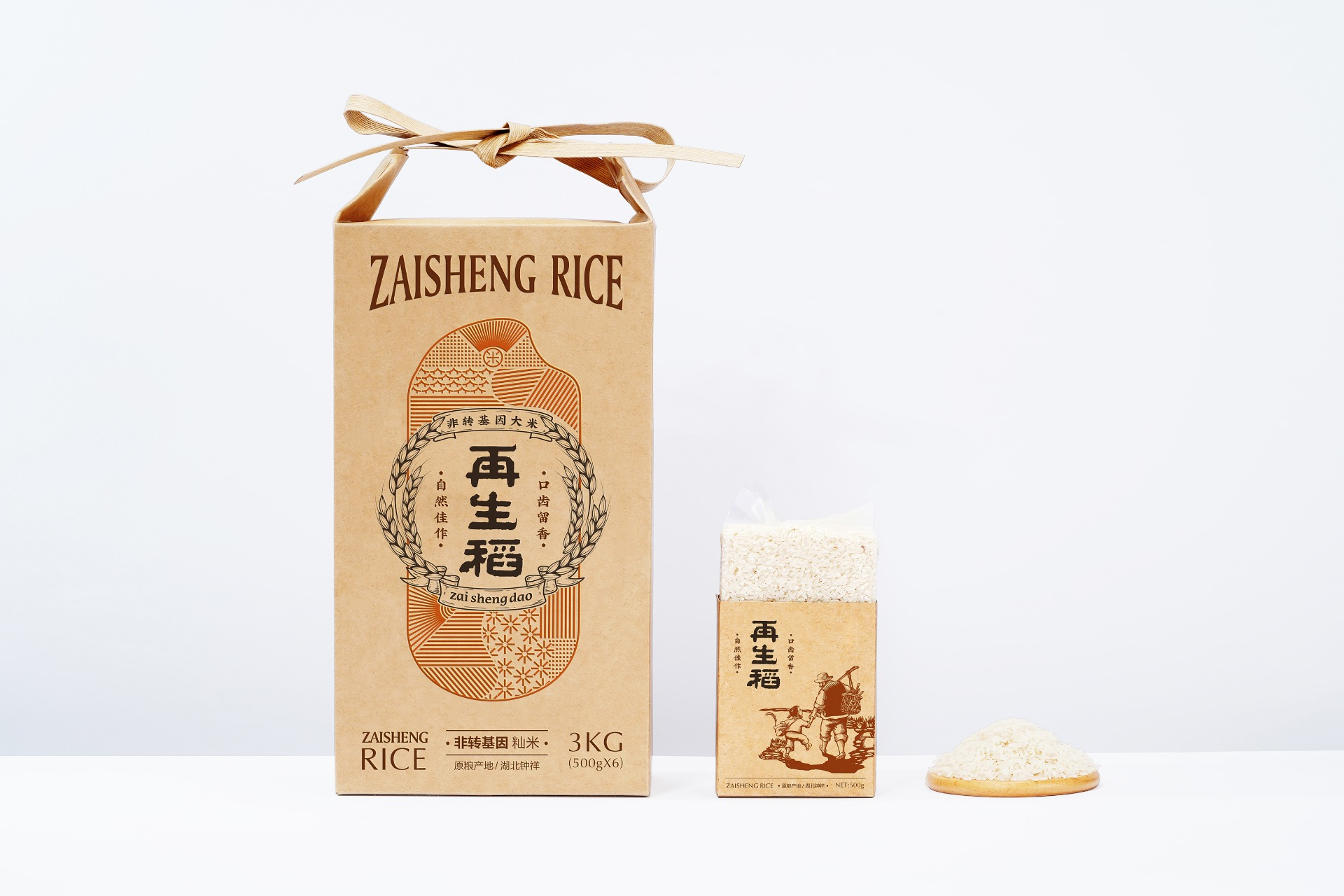
The design shows the simplicity and quality of the zaishengdao rice, expressing the farmers' yearning for life with simple and straightforward artistic language. The outer box combines the element of rice with the brand name, while the inner box uses the form of print to show the scene of farmers working.
The overall design is simple and natural, while taking into account the artistic sense. The use of kraft paper increases the cultural atmosphere of the work but also shows the concept of environmental protection. The rice elements on the front of the outer box include the natural scene of rice growth, such as fields, sunlight, rain, etc. Through the arrangement and application of these elements, an abstract picture of the harvest in the field is formed.
The design of the product name adopts the brush calligraphy font, reflecting the traditional Oriental charm and texture. The appearance of the garland composed of rice ears constitutes visual focus. Through color transformation, visual impact is enhanced. The color of the whole package design chooses brown related to the land, as well as orange and gold representing harvest and sunshine, bringing people a natural, fresh and simple design impression.
Winning Entry
Zaishengdao Packaging Design | 2022
The works show the simple and high-quality characteristics of ratoon rice, and express the longing … (Read more at NY Product Design Awards)
Qichao An
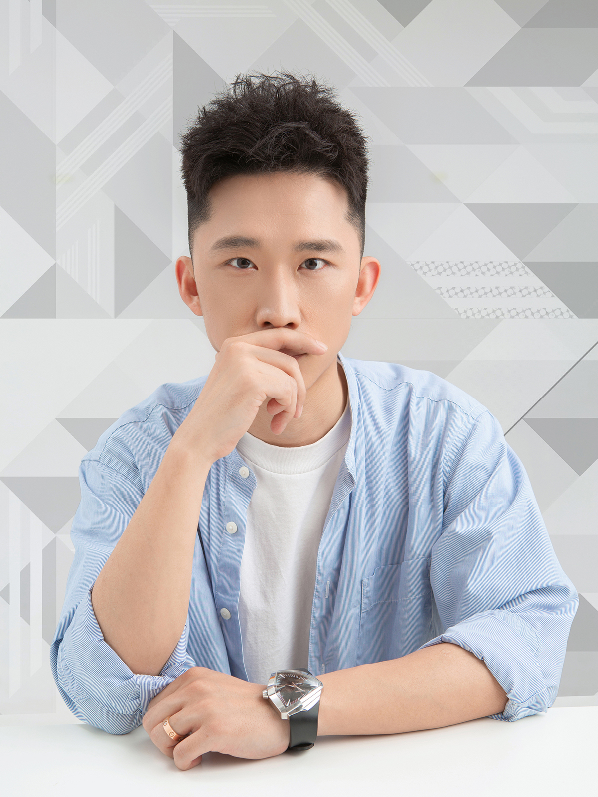
Qichao An has always had a passion for designing and worked at several professional design companies prior to expanding his career.
Read more about this article with Pepe García from Spain, the Gold Winner of the 2022 The NY Product Design Awards.


