Bite into the Visually Pleasing Apple Motifs of Shinshu Apple Pie Lab. Q!

Interview With Nicoletta Cerasomma From Italy
April 18, 2022
Interview With Andrea Francolini From Australia
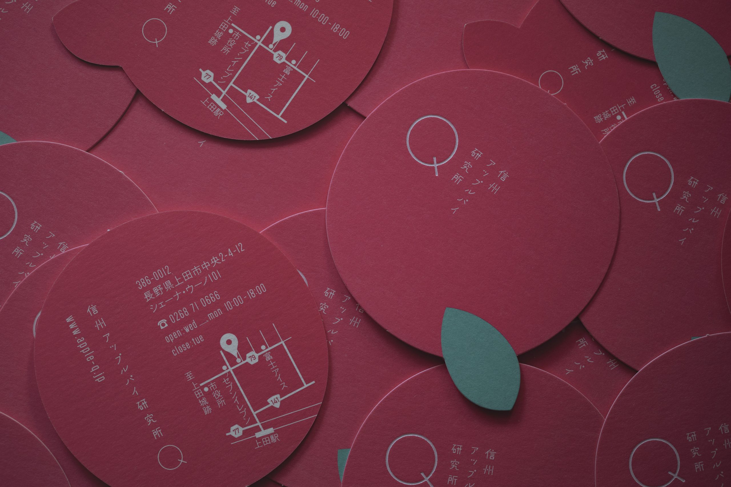
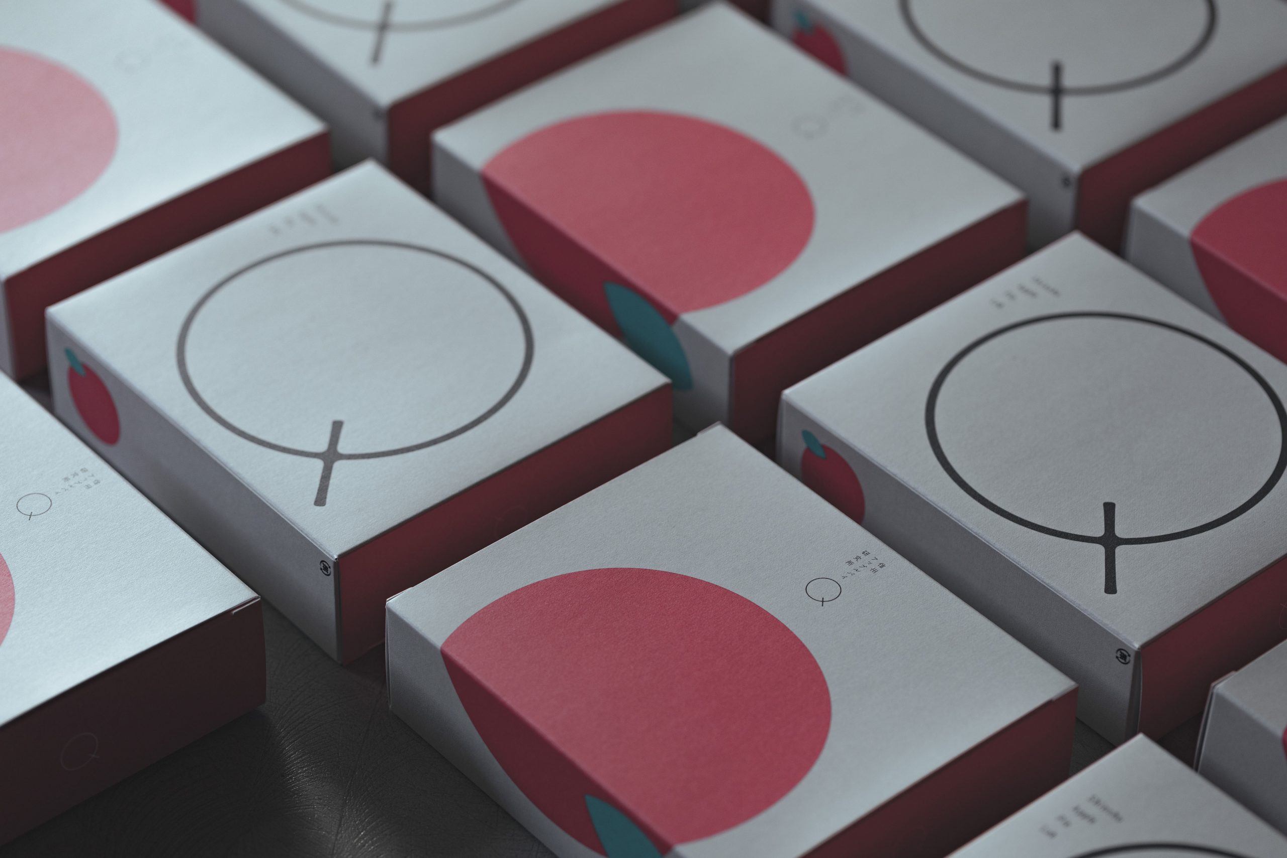
April 18, 2022With an eye for detail, arica design inc. successfully incorporated the image of an apple with the letter 'Q' for Shinshu Apple Pie Lab.
Apples are one of the most popular fruits in the Nagano Prefecture of Japan, also known as the Shinshu region.
To better promote their specialty apple pie store to the world, arica design inc. was tasked by Hojo-Seika Corporation to create a series of brand identity designs for them. The results are, shall we say, delectably pleasing!
The brand identity is one way to solve the relatively low profile of local apples, where the consumers can see and taste the apple itself in the store.
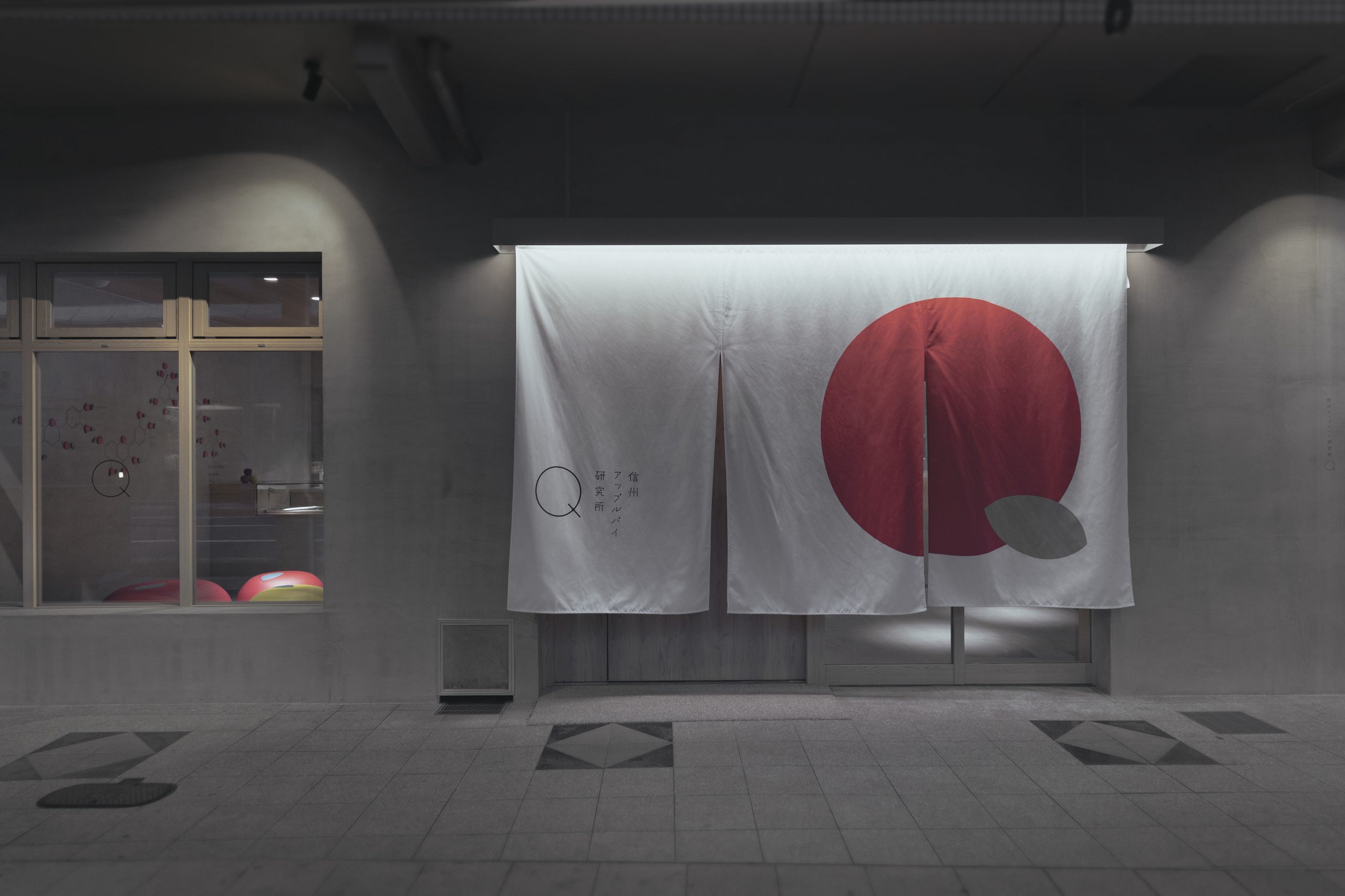
The brand spirit is emboldened with the use of the letter ‘Q’, where it resembles an apple. The materials used in the store also reflect the new and minimalistic brand identity that comes with the vision of the new brand language.
The motifs even feature the chemical structure of apple polyphenols as well, which translates to the commitment and research for apples to the consumers.
With their sheer passion for the project, it is pretty obvious how they manage to win the Platinum Winner in this year’s MUSE Creative Awards. Kudos to both arica design inc. and Hojo-Seika Corporation for blessing us with this amazing work!
Looking at new ideas pave the way for newer inspirations. Come have a read on Animaniac's social media campaign today!


