Xun Mi Honey Opens Up New Doorways To Honey Tasting

Delve Into The Nightmarish Visions Of Global Warning: Antarctica
November 14, 2022
The Seaside Hotel That Draws Inspiration From The Nudibranch
November 15, 2022Roking Art Design has led the charge in creating an all-new packaging model of Xun Mi Honey that comes in small jars.
The product has a clear branding, creating a unique visual symbol that resembles a bee tail in matching colors of yellow and black. What makes them unique from traditional honey is their packaging size, which are designed to keep consumption low and prevent waste, like how normal kinds of honey often face their destiny of being thrown away.
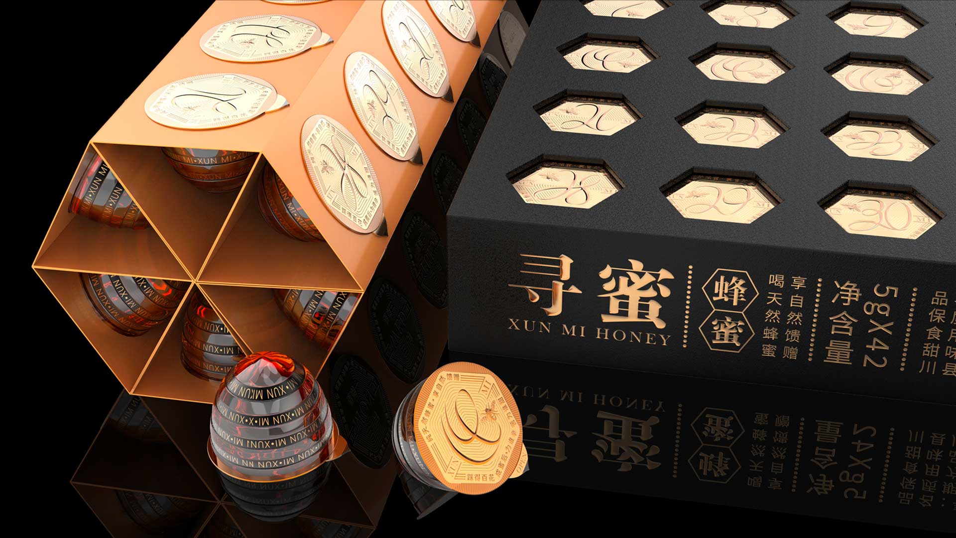
Utilizing packaging designs of small jars, not only are they easy to bring along, but can also solve the most important matter of product deterioration, or taste impact that you would normally experience in large jars of honey that are caused mainly by a prolonged time of neglection. Being in the shoes of the people, the designers fully understand the situations where wastage is common when it comes to honey, which leads to this innovative notion.
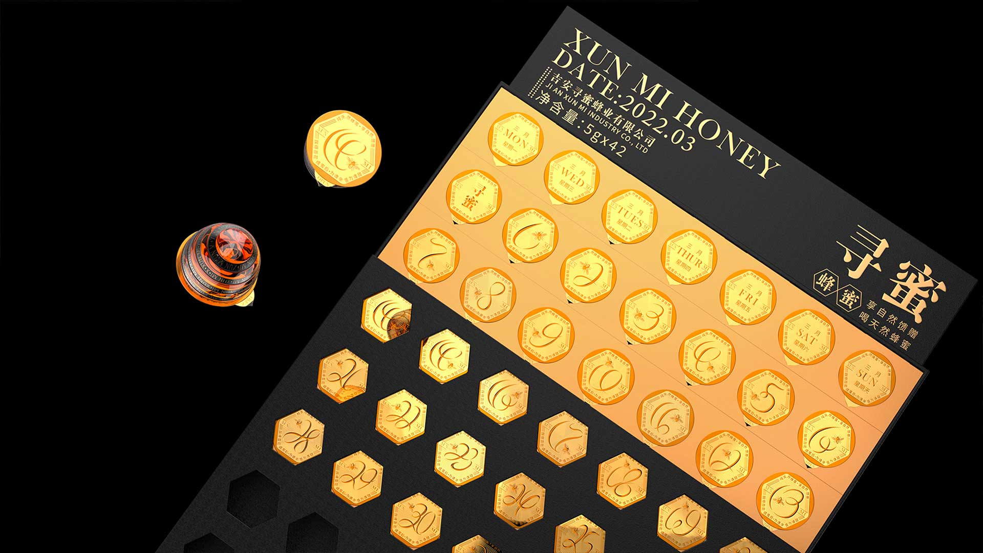
Devising concepts relating to small jars in shapes of honey bees, Roking Art Design shifts contributions to the honey bees, commemorating them for their diligence. On each jar, there is a printing of numbers from 1 to 31. If you follow these numbers, you will notice that they actually go around in spirals, referring back to everyday flight trajectories of these bees when they go around collecting honey.
The most interesting of all is that it actually comes with hollowed-out packaging, where consumers will be very intuitive to experience an imitation of the process of production. It also cleverly urges all consumers to drink honey according to the calendar date that is printed on the packaging itself. In fact, after reassembling the packaging, users are able to create a small honey board shaped as a hexagon, with 6 small calendars located at the side body, further displaying references to honeycombs.
Read on the article about Johnnie Walker Blue Label Packaging, a Scottish liquor with a complete makeover here.


